
What’s going on?!?
“All you need in this life is ignorance and confidence, and then success is sure.””
Mark Twain
Many investment markets are now at a loss this year. And many are at a loss to explain why. The below chart plots the returns year-to-date through October 27th of the SP500 (orange line), International Stocks (white line), US Bonds (teal line), Large Value Stocks (purple line), Emerging Market Stocks (blue line), and Small US Stocks (yellow line). With the exception of the SP500, everything is now at a loss, after having started the year in such a promising way, we have seen over the past few months a deterioration in markets.

So, things then are actually pretty bad?
Perhaps the economy is in a poor state? It turns out the most recent quarter the economy grew at the rate of a whopping 4.9% annualized. Consequently, economists have further reduced the likelihood of a US recession anytime soon.
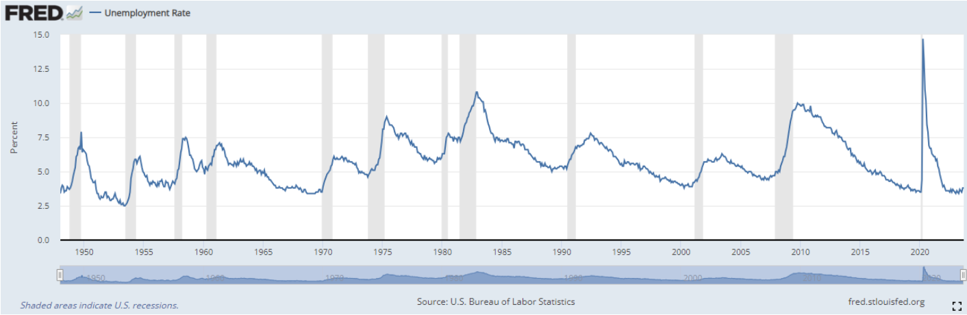
Perhaps people are lacking jobs? After all, some 68% of the US economy consists entirely of people’s personal consumption. When people lack jobs, consumption naturally falls and so does the economy. Well, the most recent reading showed a 3.8% unemployment rate, which is a low rate not just for the past several years, but for the past 70 years. Below is a chart of the historical unemployment rate since World War II until now. In short, It shows that it is a really good time to want to work.
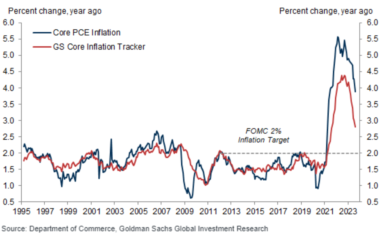
Then, it must be inflation causing turmoil in markets. Inflation grew tremendously through the pandemic from the combination of enormous amounts of government stimulus and consumers chasing a small set of ways to spend the money. Since investment markets are generally forward looking, then perhaps inflation has not started to cool. Actually, there has been great progress in this area, as well. The below chart reports core inflation over time, both from the Department of Congress and estimates from Goldman Sachs (GS). As can be seen, inflation is elevated but dropping.
Here are Goldman estimates:
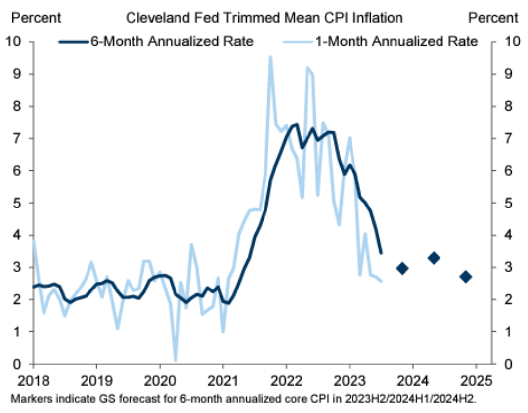
The below chart reports the Cleveland Federal Reserve’s perspective with the addition of GS forecasts, as noted by the blue diamonds. As can be seen, it suggests that the Federal Reserve (FED) has been quite successful in helping bring down inflation. This combined with the currently robust economy and employment also suggests the FED might achieve what many didn’t believe they could: a soft landing.
Well this all sounds pretty good—why are markets falling?
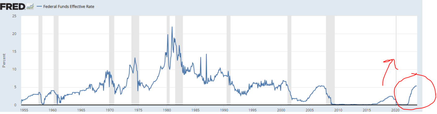
What has happened that has pressured many investment markets is a breathtaking pace of FED interest rate increases, the likes of which haven’t been seen for four decades. My red arrow on the below chart shows how steep the increase has been, which can be compared to historical FED hikes. We would need to go back over 40 years to find such a similar time of increases.
As expected with all of these FED increases, the broader bond market has also increased in terms of rates. For example, some of you might not recall, but just over a year ago you would earn just over 1⁄2% per annum in interest to loan your money to the US government. In contrast, today a 10-year treasury bond will yield almost 5% per annum, or 10 times the amount of just over a year ago! These higher interest rates are both good news and bad news. The good news is that we are currently earning significant income on our fixed-income investments. And some fixed income we use, like high yield, short term and private credit, have garnered attractive returns this year.
The bad news is that expenses are increasing for many consumers who have debt, which likely means less future spending. However, the good news is that most consumer debt is in the form of mortgages, many which are fixed at historically low rates. Looking backwards, the bad news on these rate increases means that our conventional bonds have lost value, as they are fixed rate bonds. In addition, stocks have faced downward valuation pressure as future company cash flows are now worth less in present value terms since rates are higher. Whatever the case, once the FED funds rate settles, rates will eventually go down again to reach a lower, equilibrium rate.
So, when will the FED be done raising interest rates? The most likely case, in my opinion, is a maximum of one more increase. If this is correct, we could see rates beginning to fall as soon as by the end of next year (2024). The current market pricing suggests by the end of 2024 to have the FED Funds rate at about 4.5%, or .75% less than its current level. In the long run, a 3 to 3.5% could be a reasonable nominal FED funds rate (versus the current target rate of 5.25 to 5.5%), if we look beyond our most recent very low interest rate period, as shown by the below chart.

Well, this sounds pretty promising, so should we just invest in the SP500 and not worry about it?
Not exactly. The below chart shows the 1st 11 years of this current century. The SP500 (orange line) after 11 years had actually lost money through 2011.
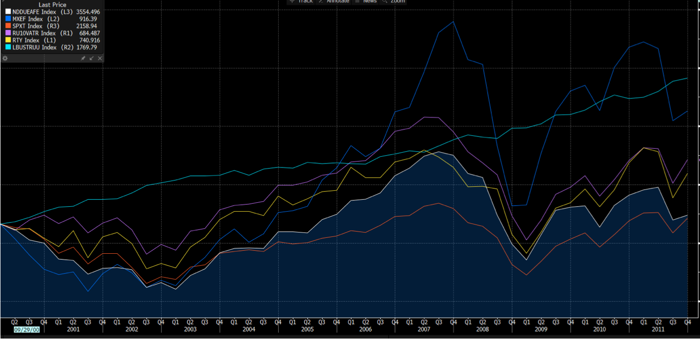
This is the same set of assets as shown in the chart in the beginning of this article. While the SP500 was the worst investment through 2011, bonds and international markets fared the best. Indeed, one could have still experience returns of 5-10% per year while the SP500 lost money after 11 years. Imagine in 2034 looking back to today and still being at a loss in your SP500 investment. It could happen.
So should we just buy the other investments that did poor in this tumultuous market period of events like the 2008 global financial crisis and September 11th? Not exactly.
For the following 11 years (through 2022 from the beginning of 2012), there was a reversal and bonds and international investments fared the poorest, the previous winners of the 21st century through 2011.

Any of you that have been with us for a while know that our answer is to have all of these assets in smart proportions, as they can thrive based on different factors. We should also have additional investments, such as private credit, managed futures, and other alternative investments to move away from only relying on conventional assets. Of course, even with a clever portfolio, there will still be volatility.
What’s the secret to not being so anxious in the face of all of this volatility?
Although some might think that the below graph is an ECG chart of cardiac arrest, it is actually a plot of the daily returns of large US stocks (SP500) for the year 2020; the year of the beginning of the pandemic.

If the chart looks scary, that’s because it is. There were 3 daily drops of over 7%, one of those over 10%. Many were wondering if this period was to become the global financial crisis all over again. But what happened by the end of the year? How would you have fared if you would have invested your money at the beginning of the year and then went off to meditate in the mountains, only to return the last day of the year? Remarkably, you would have come back with 16% more money, as that is how much the SP500 grew in value, and meanwhile would have missed out on all of the anxiety that can come from watching daily fluctuations in the markets.
Of course, there are other years like last year, 2022, where you would have come back from your mountain meditation to find your SP500 investment would have dropped close to 20% in value. However, there is an important theme here in that the less often you look at your portfolio, the more often it will be up. And since we know if feels worse to lose $100,000 than it feels good to make $100,000, less frequently watching financial markets is a strategy for finding greater happiness.
Below is a chart I created using the past 30 years of historical data on the SP500 to calculate the fraction of time that your SP500 investment would make money, depending on how often you look at its value.

As can be seen, if watching returns on a daily basis, it is almost a coin toss as to whether or not you will make money, as historically only some 54% of a year’s 252 trading days result in a gain. Furthermore, the average daily return is roughly zero. However, the probability of making money goes up to 65%, 71%, and 80%, when viewing returns over any past 1 month, 3 month, or 12 month market period. And the average returns become firmly positive, as well. I would thus modify Mark Twain’s quote with a couple added words to:
“All you need in this life is short-term ignorance and long-term confidence, and then success is sure.”
The good news now is that, unlike for quite some time, we are getting paid while we wait to look at our portfolio value. Typical Omega portfolio allocations are generating a whopping 4 to 5% annual cash yield. Thus, for most of you, simply current cash flow alone will meet your needs. That is, we can still just continue to do whatever we like to do without concern for cash flow while we wait for markets to grow in the long run, and in the short term it doesn’t matter if they go up, down, or are flat. Another way to think about it is that 100% of our portfolio is earning the rate of close to a 10-year bond while 50-70% of our portfolio has exposure to the price change in global financial markets. In short, we are truly now “paid to wait” before we look too closely at the value of the portfolio.
Should you take a break from your mountain meditation or great game of golf, and have any questions or concerns, as always do not hesitate to reach out to us. In the meantime, we wish you all a warm Thanksgiving, as we have much to be thankful for!
Your Omega Team
Omega Financial Group, LLC is a Registered Investment Adviser. This commentary is solely for informational purposes. Advisory services are only offered to clients or prospective clients where Omega Financial Group, LLC and its representatives are properly licensed or exempt from licensure. Past performance is no guarantee of future returns. Investing involves risk and possible loss of principal capital. No advice may be rendered by Omega Financial Group, LLC unless a client service agreement is in place.