
Bad News, Good News, and Some Terribly Good News
New financial index developed by Santa Barbara-based firm and UCLA Professor integrates financial and ESG factors to select US stocks that outperform the broad market while creating positive social change.
“The bad news is nothing lasts forever, The good news is nothing lasts forever.”
American singer and songwriter J. Cole
There has been some bad news as of late: It looks like the Federal Reserve might keep interest rates higher for longer. There has also been some good news as of late: It looks like the Federal Reserve might keep interest rates higher for longer. We’ll explain this duality below.
Before we get to that explanation, however, there is also more troubling news to point out: war and political uncertainty. Russia is over two years in to having invaded Ukraine, while many initially thought the campaign would be measured in weeks if not days. Then, the House recently passed a US $60 billion aid package which should help Ukraine persevere further. Early on, some were concerned this conflict could upend our energy markets and perhaps even harm our economy. However, two years on has shown that this is not the case. The real issue, in my view, is the human tragedy that has been inflicted by the conflict. And then there was Hamas incursion into Israel, with Israel hitting back with a fierce response. If this wasn’t enough, Iran launched over 300 missiles and drones into Israel. Fortunately, allied forces helped repel 99% of these projectiles, averting serious human harm. Now Israel responded with a narrow attack on Iran. Where does it all end? Although the economic impact on the US of these kinds of global events tends to be limited, the end result is surely more human tragedy.
We are also in the midst of a significant election year with much accompanying uncertainty. While some 6 months before election day is about 6,000 years in political years, we are currently back to a close call in regard to whether Trump or Biden will take office this next year.
Below is a historical chart showing both overall national polling and polling in swing and “tipping” states. These latter two polls are what especially matter for our electoral college system.
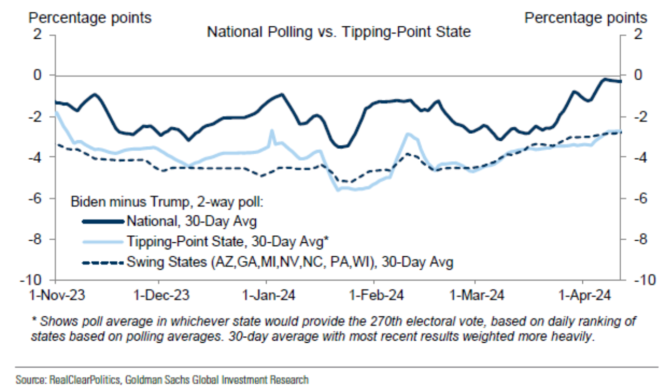
This chart tells us that, while on a national basis Biden is even with Trump (i.e., ~0% difference), Biden is trailing by almost 3% in tipping-point and swing states. For example, CA is inconsequential for the presidential election, as surely the state will award its electoral college votes to Biden by a large margin of victory. However, PA is consequential, as it is one of the states that can tip the final electoral college scale to either Biden or Trump.
Similarly, it is currently a toss-up regarding which party will control the House of Representatives (i.e., 56% implied chance from betting odds for a Democratic win). The Senate control, in contrast, seems likely to be Republican (i.e., 70% implied chance of betting odds for a Republican win).
Historically, though certainly not a guarantee of the future, the best US government structure for the economy and financial markets tends to be a divided government. Based on straight-forward probability calculations from betting odds, a divided government is currently the most likely case (i.e., ~77% chance of a divided government vs. 14% fully Republican and 9% fully Democrat). Whatever the case, while it’s true that politics can create a lot of short-term market volatility, it has surprisingly small impacts on the long-run success of the economy and financial markets.
The current news that does have a direct impact on the economy and financial markets is elevated interest rates. At the beginning of the year, we placed the most likely outcome as the Federal Reserve starting to lower interest rates in June of this year. However, due to an especially robust economy and inflation rates receding more slowly, the Federal Reserve will likely need to keep rates “higher for longer” to slow the economy and finish tamping down inflation close to its 2% target rate. Below is a chart of changing market expectations of the path of Federal Reserve interest rate cuts.
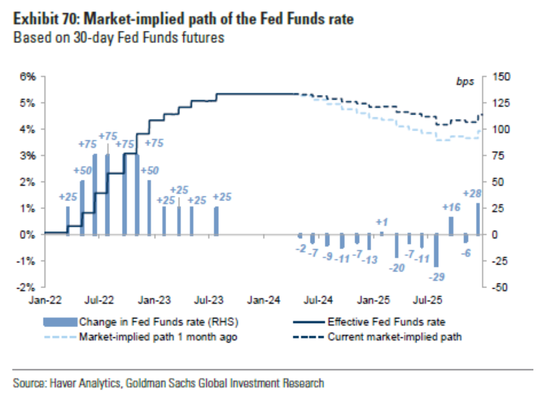
The light blue bars show the actual interest rate increases (LHS) and the predicted interest rate decreases (RHS), as a function of time. The solid dark blue line shows the actual steps of increases up to our current 5.25-5.5% Fed Funds rate and the dashed dark blue lines show the market implied expectation, which is to be about 1% lower 1 year from now. The light blue dashed line below shows the market implied expectation 1 month ago. Since it is below, it shows expectations now have rates staying higher for longer.
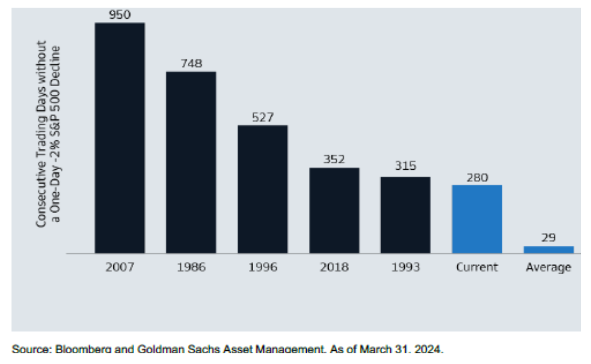
Higher interest rates mean loans are more costly, which means companies, consumers, and investors will likely invest and purchase less, which means less economic activity. Higher interest rates also mean a lower present value of future cash flow and profits, which is why stock prices tend to jump around as expectation of Federal Reserve interest rate moves change. Our current month of stock market volatility has primarily been driven by this phenomenon. A second reality is the stock market had been unusually stable leading up to March. Typically, the stock market falls at least 10% every year and at least 2% in one day about every month. Coming into April, it had been 280 days since we experienced a daily drop of at least 2%. Of course, it is very difficult to time falls of 2%. And, as volatility increases, it becomes increasingly costly to try to time markets.
The below chart reports the historical average of days until facing a 2% daily drop (i.e., 29 days) and the current period along with others where there was extended period before such a daily drop.
Enough with all of the bad news; there is also good news! In turns out that higher interest rates are often good news, too. For bond investors, it means more income through a higher yield. While it’s true a jump in interest rates causes a drop in current bond price to adjust for higher market bond yields, the higher yields can be enjoyed for multiple years and, depending on the length of time of investing in bonds, that higher yield over multiple years can more than make up for the drop in price.
Higher interest rates can also be good news because, as in the current situation, they are often the consequence of a strong economy. An economy can run “too hot,” which means higher inflation. Higher inflation is reduced by slowing the economy down, which the Federal Reserve does through increasing interest rates. For companies, higher inflation with a strong economy means strong demand for their goods and services, which benefit can more than overcome their higher cost of interest on their own loans and higher costs of supplies. Indeed, higher inflation can still create both greater stock and bond returns.
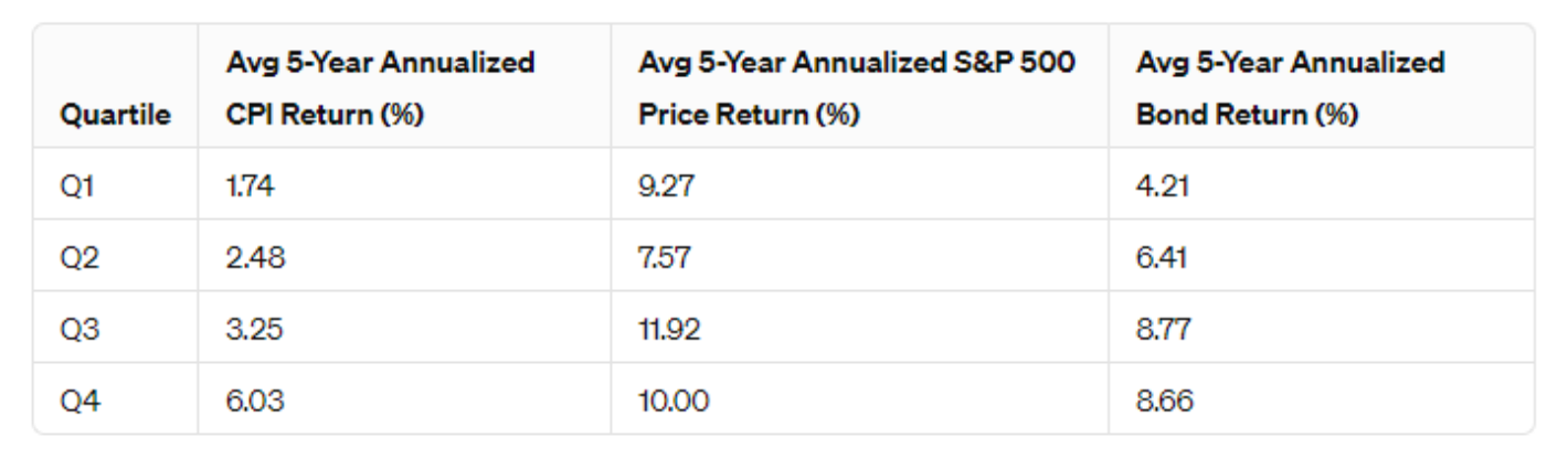
We created the below table to show the return of stocks (measure by the S&P 500) to study the 5-year annualized returns of stocks and bonds during different levels of inflation. To do so, we divided the 5-year annualized levels of CPI into quartiles (i.e., into four equal bins based on the level of annualized 5-year inflation). We then compared the returns of investing during those four levels of inflationary environments (i.e., Q1 = lowest and Q4= highest inflationary period). Data used for our analysis was obtained from Bloomberg and begins in March, 1947 and ends March, 2024.
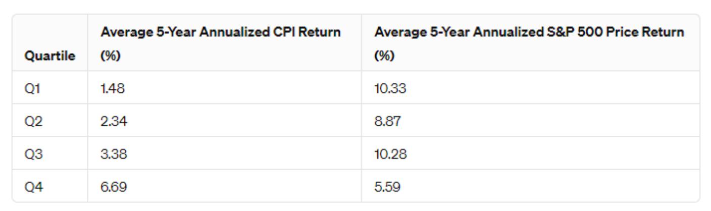
Interestingly, the relationship of stock returns to inflation is non-monotonic: the lowest and moderate inflationary environments (inflation averaging ~1.5% and 3.4%, respectively) generate a similar average stock return of ~10.3% per annum. Of course, the after-inflation return is still better for the lowest inflationary environment (i.e., about 8.9% vs. 6.9% annually). However, Q3 is still better than a Q2 environment. That is, when inflation was above average (and averaged about 3.4% per annum), stock returns were higher than in a below average inflation environment that averaged 2.34% per annum (note the Federal Reserve has a stated inflation target of 2% per annum). This outperformance in higher inflationary environment still holds after the higher inflation of Q3.
All said, it is certainly true that very high levels of inflation (Q4), where inflation has averaged a whopping ~6.7% annualized for 5 years is damaging to stock returns. Here the average after-inflation return was losing about 1% per annum for five years (i.e., 5.59% minus 6.69%).
But what about bond investments? I suggested that they can also do better during higher levels of inflation due to higher interest rates providing higher levels of income. The below table reports our same analysis as above, but now we add a column for 5-year annualized bond returns, as represented by the Bloomberg US Aggregate Index. This table now covers from June, 1976 through March, 2024, due to availability of the Bond data. Using this time period also helps overcome the potential issue that the previous analysis was skewed by some aberrational post-World War II economic phenomenon.
Remarkably, the non-monotonic relationship between stocks and inflation still holds: The worst performing inflation period is actually Q2, with average 2.5% annual inflation. However, now Q3 does even better than Q1 (the lowest inflationary periods) both absolutely and after inflation. All the while, bonds perform better the greater the inflationary environment, with the highest inflationary environment (Q4) roughly the same as Q3. Naturally, after inflation, Q3 is even better for bonds.
Of course, we don’t generally choose between stocks and bonds but use them both, as well as a whole variety of other public and private investments. To illustrate how investing in both stocks and bonds works during different inflationary periods, we constructed a 60/40 mix of the stock and bond indexes used above and then also calculated the overall portfolio returns after inflation (i.e., “Real Return”). These results are as follows:
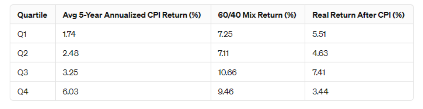
While below average inflation is about the same (i.e., returns of just over 7%), above average inflation shows moderately above average (Q3) is better than high inflation (Q4). In terms of Real Return, again, below average inflation environments both produce close to a 5% real return, which is a great long-run return. This means you could spend 5% per year and increase spending each year at the rate of inflation without dipping into principal, on average. Meanwhile, the best performing scenario both before and after inflation is Q3, where inflation averages 3.25%.
So higher for longer for the strategic investor can be terribly good news. Does this mean we should keep hoping for inflation and interest rates to stay elevated? That might not be such a bad outcome. Nevertheless, the challenge with Q3 is it is typically a often a transitory level of inflation, where we are going to go higher (not good) or lower (Q1 or Q2) which is good.
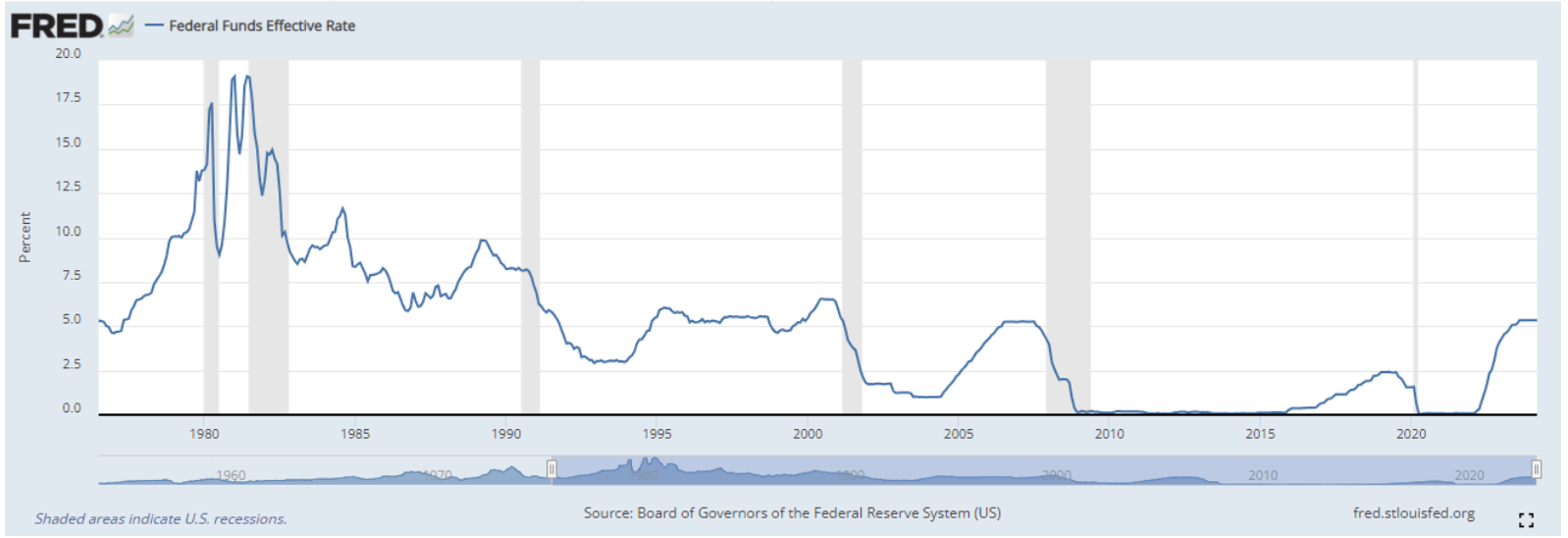
All said, it is quite possible interest rates could stay higher for much longer than we expect. I am always struck by how we don’t know what we don’t know (or at least know less than we think). Indeed, the previous cycle of roughly zero interest rates lasted much longer than virtually everyone expected, as shown by the below Federal Reserve chart. From December, 2008 all the way through February of 2022 Federal Funds were most often roughly 0%, with the exception of a short interlude of rate increases from February, 2016 through February, 2019 where rates peaked at just under 2.5%, only to soon fall back down to roughly 0%.
So, although all of these market expectation adjustments can create significant swings in short-term portfolio value, we do have some additional good news at this higher level we’re at, and apparently staying at for longer; currently, a typically Omega portfolio is enjoying a cash yield 3-5% per annum, depending on your allocation. This means you’re currently making 3-5% annually, regardless of what happens to the price of stocks or any other financial asset. For many portfolios, this means that over half of the return is already set in place via yield, and we’re being paid to wait for financial assets to finish working through historically normal volatile periods and then appreciate. That same yield figure a couple years ago would have only been 1-2%, meaning we were not getting paid much to wait.
While you are being paid to wait, we are doing several things to help with this “higher for longer” scenario. First, we are rebalancing portfolios out of balance to make sure they are best positioned as we transition to a lower inflationary and interest environment. Second, we are analyzing a couple positions that have proven lackluster during this slower transition. Third, we are reviewing the credit management of each client, in light of higher interest rates for longer. Lastly, we continue to encourage those that enjoy wine to keep on sipping, as this is one of the few items in the CPI basket that has grown much more slowly these past years (approximately 1/3 the pace of overall inflation).
As always, should you have any questions or concerns, please reach out to us. Otherwise, we look forward to visiting at our next review!